Wednesday, 31 October 2012
Sour Patch Kids
FSDU of NEW Maynard sweets ‘Sour Patch Kids’,supporting facebook page with download game and content generating competition.
Sour. Sweet. Gone... Sour Patch Kids are irresistible for their Sour then Sweet taste!
The FSDU is pretty standard but is doing a good job,
It’s almost empty! Nice little die cut header too.
Good level of activity on the facebook page, engaging and fun!
They look like grown up jelly babies!
Limited Edition Product and Packaging
RC Cola has created intrigue in a pretty boring product by giving
it a new twist for Halloween. As well as turning the cola a ‘blood red’ colour, they have changed the product name to ‘Dracola’ and also made the label glow in the dark.
Changing the colour of the product to something unfamiliar creates enough intrigue for people to buy on impulse.
While the name change and packaging re-design, with glow in the dark feature, ties the whole idea nicely into the
Halloween theme.
RC’s limited edition red cola, RC Dracola, will be available from
the 29th September at 217 Asda stores across the UK. The
name Dracola was created by Asda customer, Jodie Daubny,
following a nationwide competition this year.
Tuesday, 30 October 2012
Krave - TV, Digital, hand-out
Kelloggs have recently launched their new product – white chocolate flavoured Krave cereal. There was a digital countdown online and on October 8th at 9am, the official ‘launch’ was showcased on the Krave Facebook Page and via a YouTube masthead. The launch was centred around a video of a real shopping trolley containing cereal boxes and then literally being launched from a ramp, rocket stylee!
In the run-up to the campaign a competition on the Krave Facebook Page, invited fans to guess where the boxes will land for the chance to win a trolley-full of prizes, including a white 16GB iPad, speakers, a crate of Krave cereal and other branded merchandise. The digital campaign was targeted at the 16-24
year-old age group.
This was supported by a TV advert, Facebook ads and had promotional teams handing out leaflets, which showcased the new product with a chance to win tickets to Thorpe Park. The team were present outside the MEN Arena on my recent visit to Manchester to see Ms. Cole, were a large selection of the audience will have been the desired target audience of the digital campaign.
Collect Clover Hearts
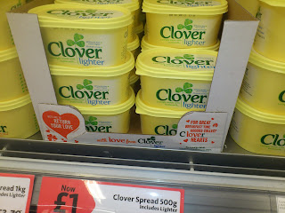
Clover has launched a loyalty scheme aimed at the breakfast time occasion. Consumers are invited to collect ‘Clover hearts’ in return for breakfast time products.
There are three to collect, a heart mug, a heart-shaped side plate and toast rack. To redeem, you need to collect the Clover Hearts on wrappers inside tubs of Clover, once you have enough, you download a collector form from the microsite and post it together with your collected wrappers. The promotion is supported by social media, targeted DM and emails.
Nice relationship with the cLOVEr hearts and product name, that is carried through to the redeemable products.
They also have used Facebook to communicate this promotion, with people uploading photos showing them using the crockery as part of their breakfast. Maybe they could have linked this to a competition in order to increase their Facebook fans, such as “upload a photo showing you enjoying your Clover Hearts breakfast time goodies and be in with chance to win a weekend break to Paris, city of love” for example.
Mars Confectionery Fixture
This Mars fixture showcases the product range really well and also features the M&M’s characters.
There was a huge presence in-store of the M&M characters and merchandise. You could buy t-shirts, pj’s, everything! The entire store was immaculate and all the stock well replenished.
The fixture looks really clean, tidy and easy to shop with the added fun of the characters making it more engaging for the shopper.
To see more of the store http://www.candyliciousshop.com/
Campo Viejo Prize Overlay
Campo Viejo have a prize overlay to, ‘WIN £25,000 to make your dream home project a reality’. This is a great prize, however, it would only appeal to an older age category. The competition is in partnership with Grand Designs magazine & exhibition. The lower tier prize is to win a set of pantone mugs, which are the colours used in the core creative.
The creative has a Spanish feel to it, with the taste of Spain being released from the bottle. It’s eye catching and attention grabbing when flicking through Shortlist magazine. Unfortunately the instore pieces don’t have as much stand out as they haven’t used the vibrant yellow and orange tones.
Our very own M&M's Big Night In unit
The shape and structure of this unit is really strong. It displays the product well and looks great in store. It would have been nice to see the characters bigger.
This unit has been placed in a position within the store that allows it to be ‘spotted’ and accessed with ease. The pack shots have been arranged nicely on the unit considering how many of them have been included.
This unit has been placed in a position within the store that allows it to be ‘spotted’ and accessed with ease. The pack shots have been arranged nicely on the unit considering how many of them have been included.
Thursday, 25 October 2012
Anchor; made by cows
This is a campaign from 2010, however, I love the typography and the unique approach. Here is a link for more info: http://www.jellylondon.com/illustration/casestudies/7/anchor-made-by-cows
Direct Line set up a zip wire in Covent Garden
Monday, 22 October 2012
Halloween Nestle combo
Attractive little halloween Nestle combo FSDU containing Smarties pumpkins and Milkybar ghosts although they could have done a lot more to make the creative work better. The jagged dividing line between the creative is clumsy!
Thursday, 11 October 2012
Bombay Sapphire packaging that illuminates...
The packaging features an illustration by Yehrin Tong that has been produced in electroluminescent ink.
The electric current is conducted from a battery at the bottom of the pack and a hidden mechanical switch is triggered when the packaging is picked up from the shelf, causing it to light up.
The Global Travel Retail pack, which was developed by Webb deVlam with German packaging manufacturer Karl Knauer, is aimed at the travel and duty-free market.Wednesday, 10 October 2012
Jameson Great Urban Escapes
Pernod Richard’s Jameson has rolled out a new limited edition bottle that celebrates some of the world’s most exciting
cities and its best bars providing a short guide for visitors.
The bottle’s label is designed to demonstrate logos and emblems from the top districts of seven cities across the world. As part of the campaign, a city guide app has been created to provide consumers with information on what to see and do in four of the mentioned cities. People without smartphones can also get a traditional printed city guide when they buy a limited edition bottle.
Entitled as Jameson Great Urban Escapes, the bottle is available only through travel retail channels, for a limited period. The bottle is created for those who like to explore new exciting
places in the urban landscape.
The POS stand is engaging and eye catching. I’m a big fan of the way in which Jameson has twisted their traditional, old fashioned
branding to make it look trendy and urban. Their new limited edition look and feel reaches out to consumers who wouldn’t usualy choose Jameson as their regular tipple.
Strongbow
Pub coaster with Halloween strongbow promo. The skull illustration using apples and pips is very nice!
Needs a little more info on where to go for MORE INFO and how to enter other than a tiny copy line that says ”please see posters in outlet ...”
before you ask there is nothing on the back!
Monday, 8 October 2012
Wednesday, 3 October 2012
Walkers Deep Ridge
FSDU displaying New Walkers Deep Ridged crisps.
NEW Walkers Deep Ridged has ridges twice as deep, bold flavours and is made with 100% British Potatoes ... guaranteeing epic satisfaction.
Detail Die cut of the mountains used across the campaign work well. The New flash should be on the header and could do with being a bit more EPIC itself!
Monday, 1 October 2012
Andrex Shopping Mall Tour
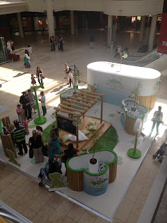
Andrex were promoting their new Eco range with this fantastic shopping mall tour. The stand was very interactive and engaging. The new Eco range is all about how soft the roll is, there was plenty out on display for shoppers to feel as well as being given a roll to take home (with a 50p off coupon off their next purchase).
The iPads allowed shoppers to interact with the brand by uploading their ‘bamboozled’ faces and entered into a prize draw to win Eco prizes such as solar MP4 players, solar iPod docks and Eco holidays.
Overall the stand was great, there was a lot of interaction with the shoppers and loads to do.
See more here:
http://www.creativebrief.com/new-work/permalink/643/?close_cookie=1
Subscribe to:
Comments (Atom)


+2.jpg)


.JPG)


.JPG)
.JPG)

+2.JPG)
+2.JPG)


