Tuesday, 27 November 2012

Co-branded FSDU featuring Bombay Sapphire & Fever Tree Tonic


This split branded FSDU seemed to come pre-loaded with both Bombay Sapphire Gin and Fever Tree Tonic, creating an ideal serving occasion from the two premium brands. 


The black branded creative is striking and certainly has a premium feel, making the most of the rather plain Tesco yellow. 
On the downside, whilst there does appear to be a 20% offer, 
this is not communicated properly, with effective pricing messages missing. 

Bacardi Online


Taittinger

Taittinger have created an award winning 'Bubbles' hologram-effect gift packaging for their Prestige Rosé and a similar design for Taittinger Brut Réserve NV and Vintage 2005. The 3D sparkling bubbles are so realistic that you don't realise until you touch the side that the bubbles are not in 3D but completely flat.


Wednesday, 21 November 2012

Tetely


Tetley tea is the exclusive sponsor of family movies’ on Channel 5 on Sunday afternoons. The idents, entitled “Make time together for the family movie”, are shown before the film starts and in between ad breaks. They show members of different families watching a film with brew, with each one having a movie based humorous aspect. 

A coherent link in for Tetley, will be interesting to see how roll it out across the planned print and online channels. 
Amy Holdsworth, marketing manager at Tetley, said: “Tetley knows a good cup of tea helps bring people closer, and we’re proud to support the perfect opportunity for families to spend time together.” According to Greg Fuller, business director at MediaVest, “research showed Sunday afternoons were one of the very few occasions that the family could get together and enjoy each other’s company, and we wanted Tetley to be at the heart of those special living room family moments.” 


Tuesday, 20 November 2012

Cadbury Christmas FSDU


Cadbury have created this rather nice FSDU to promote their Christmas products. Overall the design is based on Cadbury's traditional Christmas design using Reindeers, Santa Claus and Snowmen to attract shoppers looking for stocking fillers. 

The design is also used across their products and website.
The unit really stands out at the till point attracting a wide audience. It’s a shame Nisa have covered part of the creative on the side and shelves. They have also placed non-Cadbury products in the unit. Nisa have also placed a promotional shelf barker on the shelf holding a selection box. This is quite confusing for the shopper, as the promotion is only actually on that one product and once again covers the Cadbury message ‘Make Christmas magic with Cadbury’. 


Thursday, 15 November 2012

These little fellas make a bright and colourful display, so are certainly effective in grabbing your attention while you’re perusing the cold meats.
The die-cut header is great because it’s as though the little chaps are blocking the fridge saying: “don’t buy yogurts, buy meeee”.
Quite why Co-op decided their ‘NEW’ signposting was needed, nobody will know – perhaps they were worried about the shorter children. Also, if you’re going to be targeting wee kiddywinkles, don’t teach them bad grammar – ‘natural colours’ in the speech bubble does not need capitalisation. 


Giant Covent Garden Soup


Monday, 5 November 2012

Grants Whisky display


 The display contained four versions of the whisky with a description on front of the bottle and a leaflet to take away. The unit itself took up half a display which is rare down a BWS aisle as there are so many products to fit in such a small space.


The unit works very well. Its impactful, it holds the stock well and also shares information. For someone who knows very little on whisky it was interestiing to read. 


Wednesday, 31 October 2012

The Extra Challenge


Sour Patch Kids


FSDU of NEW Maynard sweets ‘Sour Patch Kids’,supporting facebook page with download game and content generating competition.

Sour. Sweet. Gone... Sour Patch Kids are irresistible for their Sour then Sweet taste!

The FSDU is pretty standard but is doing a good job, 
It’s almost empty! Nice little die cut header too.
Good level of activity on the facebook page, engaging and fun! 
They look like grown up jelly babies! 


Limited Edition Product and Packaging


RC Cola has created intrigue in a pretty boring product by giving
it a new twist for Halloween. As well as turning the cola a ‘blood red’ colour, they have changed the product name to ‘Dracola’ and also made the label glow in the dark. 

Changing the colour of the product to something unfamiliar creates enough intrigue for people to buy on impulse. 
While the name change and packaging re-design, with glow in the dark feature, ties the whole idea nicely into the 
Halloween theme.

RC’s limited edition red cola, RC Dracola, will be available from
the 29th September at 217 Asda stores across the UK. The
name Dracola was created by Asda customer, Jodie Daubny,
following a nationwide competition this year.


Tuesday, 30 October 2012

Krave - TV, Digital, hand-out

Kelloggs have recently launched their new product – white chocolate flavoured Krave cereal. There was a digital countdown online and on October 8th at 9am, the official ‘launch’ was showcased on the Krave Facebook Page and via a YouTube masthead. The launch was centred around a video of a real shopping trolley containing cereal boxes and then literally being launched from a ramp, rocket stylee! 


In the run-up to the campaign a competition on the Krave Facebook Page, invited fans to guess where the boxes will land for the chance to win a trolley-full of prizes, including a white 16GB iPad, speakers, a crate of Krave cereal and other branded merchandise. The digital campaign was targeted at the 16-24 
year-old age group. 

This was supported by a TV advert, Facebook ads and had promotional teams handing out leaflets, which showcased the new product with a chance to win tickets to Thorpe Park. The team were present outside the MEN Arena on my recent visit to Manchester to see Ms. Cole, were a large selection of the audience will have been the desired target audience of the digital campaign.


Collect Clover Hearts

Clover has launched a loyalty scheme aimed at the breakfast time occasion. Consumers are invited to collect ‘Clover hearts’ in return for breakfast time products. 

There are three to collect, a heart mug, a heart-shaped side plate and toast rack. To redeem, you need to collect the Clover Hearts on wrappers inside tubs of Clover, once you have enough, you download a collector form from the microsite and post it together with your collected wrappers. The promotion is supported by social media, targeted DM and emails. 


Nice relationship with the cLOVEr hearts and product name, that is carried through to the redeemable products. 
They also have used Facebook to communicate this promotion, with people uploading photos showing them using the crockery as part of their breakfast. Maybe they could have linked this to a competition in order to increase their Facebook fans, such as “upload a photo showing you enjoying your Clover Hearts breakfast time goodies and be in with chance to win a weekend break to Paris, city of love” for example. 


Mars Confectionery Fixture

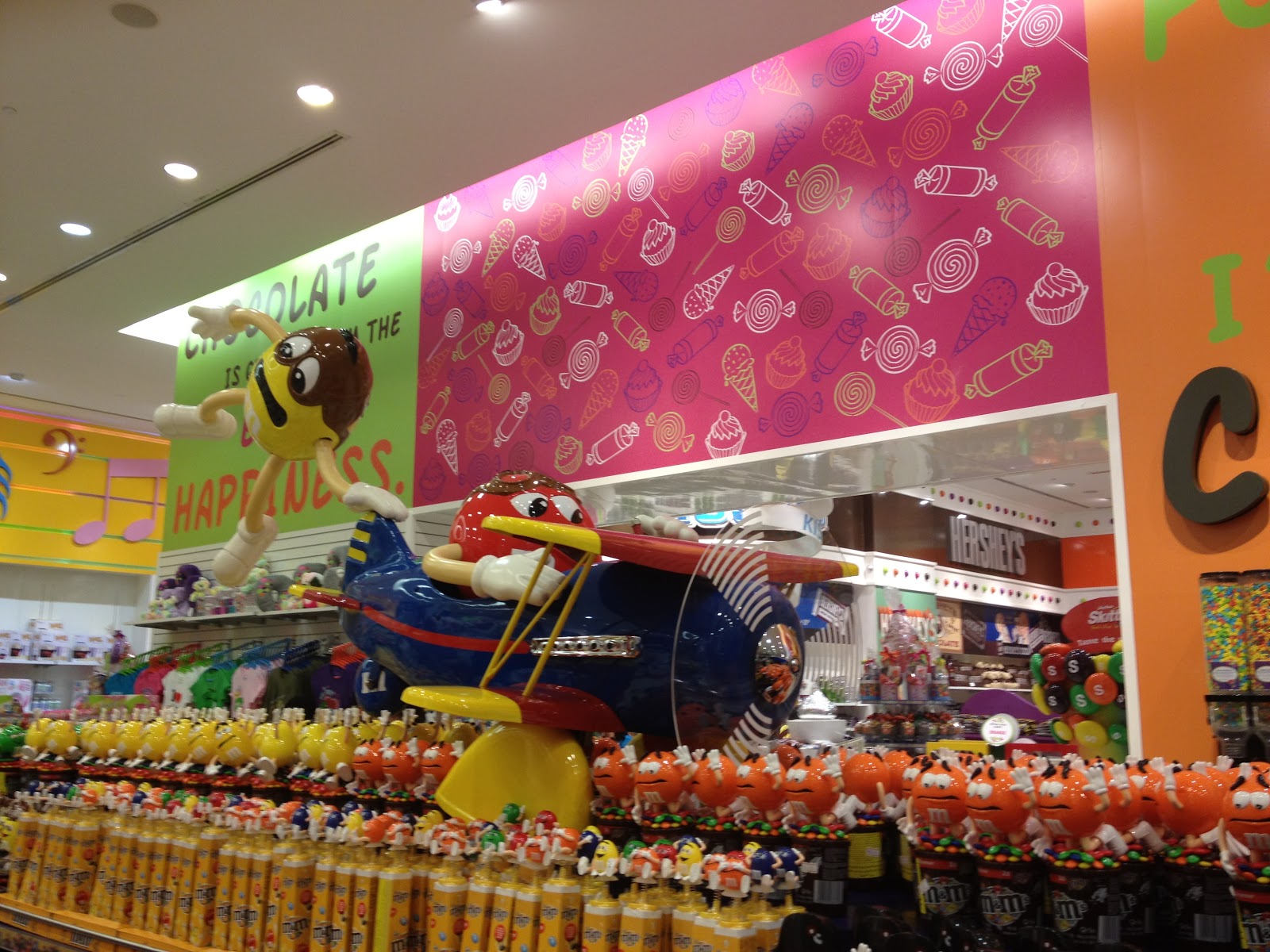
This Mars fixture showcases the product range really well and also features the M&M’s characters. 
There was a huge presence in-store of the M&M characters and merchandise. You could buy t-shirts, pj’s, everything! The entire store was immaculate and all the stock well replenished.
The fixture looks really clean, tidy and easy to shop with the added fun of the characters making it more engaging for the shopper. 

To see more of the store http://www.candyliciousshop.com/ 


Airwick FSDU

Lovely creative!